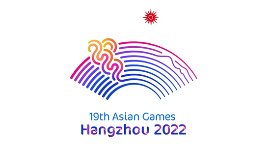
On the morning of October 21st, the Hangzhou Asian Games released its color system "Harmony of Colors".
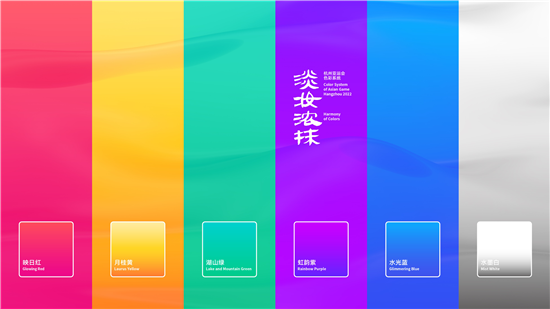
Rainbow purple, glowing red, Laurus yellow, glittering blue, lake, and mountain green, six colors with very poetic names have been well received once they have been released. However, in a world of thousands of colors, why these six colors? What is the source of these names with a Jiangnan rhythm in them?
We interviewed the designer Guo Jinyong, deputy director of the Department of Integrated Design of the School of Design and Art of China Academy of Art, director of the China Pop Color Association, and Ph.D. in colorology and asked him to tell us the story behind the color system.
The six special colors of rainbow purple, glowing red, Laurus yellow, glittering blue, lake, and mountain green not only contain the lush natural environment of lakes and mountains but also blend the passion of innovation and vitality.
The design inspiration for the whole set of colors comes from the natural landscape and typical culture of Hangzhou. The theme name "Harmony of Colors", from the Song Dynasty poet Su Shi's verse "West Lake, by comparison, a perfect match for Xizi. Harmony of Colors, either way appropriate”. Each color corresponds to a poem describing Hangzhou. Guo said: "Hangzhou is the capital of Zhejiang, but also a very important part of the Tang poetry culture, so poetry has also become the inspiration for our creation."
The main color, "rainbow purple", consistent with the color of the Hangzhou Asian Games emblem "Tides Surging", is inspired by the Tang Dynasty poet Bai Juyi's "Remember Jiangnan Jiangnan Memory”: " At sunrise riverside flowers redder than fire, In spring green waves grow as blue as sapphire,"
In the five auxiliary colors, "glowing red", which takes the light and rhyme of the sun, originates from the Southern Song poet Yang Wanli's " Dawn Sendoff For Lin Zifang At Jingci Temple": " The emerald lotus leaves reach as far as where water and skies meet, and lotus blossoms bathing in sunshine exhibit a distinctive dazzling pink”. This color corresponds to the passionate competition items in its application in the events.
"Laurus yellow”, containing the sweet-scented aroma of Osmanthus, is from the poem "Dreaming of the Southern Shore", which applies to traditionally competitive events. Lake and Mountain Green, which takes the meaning of green mountains and ecology, is from the poet Gong Zizhen in Qing Dynasty "Moon in Xiang: sky wind blowing me": "the wind blows me, fall to the corner of the lake mountain, no doubt to its beauty". It will be applied to the ball game items. "Glittering blue", with the clearness of the sunlit sky and wavering water, is from Su Shi's " Drinking on the Lake, First Sunny, Then Rain ": " Water glistening with ripples beautiful on sunny days, Mountains with haunting mist spectacular in the rain”. The application corresponds to the water race events.
The last color, "mist white", works as an intercolor, plays a role of adjustment between several colors, is from the Northern Song poet Liu Yong's " Watch Sea and Wave Beautiful Scenery of Southeast ".
As early as last winter, Guo and his team began to prepare the color system design. Before the final design, there has been a total of more than ten rounds of major changes. The official release is labeled "Version 12.0" on their computers.
Each color needs to be tested on different materials bit by bit, paper, fabrics, spray effects, electronic screen effects, etc. until they find a color scheme that has good expressiveness on all kinds of materials and is also very coordinated when all colors combined together. Furthermore, the overall color system should balance with the Hangzhou Asian Games all the visual elements.
Colors can be applied in a variety of places, from scenes to logos. Guo Jinyong said that in the design process of the color system, in addition to the team itself in the constant pursuit of "extreme", with other design team collaboration and communication, but also a factor in the revision.
"For example, the emblem and the sports icon from Professor Yuan Yumin's team, professor Cheng Chaoxuan's core graphics, and the overall landscape design, etc., all need a regular communication with one another, so the workload is actually quite massive." In the process of gathering information, there are more than a dozen graduate and doctoral students in the team and more than a dozen in the core team.
Compared with the previous Asian Games color systems, what is different is that in this Hangzhou's color system, all colors released, are gradient colors.
"The color we're releasing this time isn't a fixed color, but a range. The advantage of doing so is that under different conditions, we can always try to coordinate the colors to a most harmonious and comfortable state. Guo Jinyong said that color is relative, the same color’s effect is different in different lighting. Gradient colors are more flexible and adaptable comparing to a single color.
"The trend for future color applications should be on the media side of the future." Guo Jinyong said that the visual system presented in the 1990 Beijing Asian Games was commonly applied in television, newspapers, magazines, and other traditional media. With the popularity of electronic products in modern society, the visual system of Hangzhou 2022 Asian Games will be presented mostly on electronic screens.
Gradient colors can give the color a better application in a relatively complete system. "The idea we create is the fusion of light and colors. The selected color is more suitable for the rendering of shade (on the screen). "
For example, in traditional printing technology, purple is actually a very difficult color to express, since it is easy to cause color deviation or dullness in the printing process. Choosing rainbow Purple" as the main color of the color system for the Hangzhou Asian Games, from the perspective of traditional media, is indeed a little risky, but "putting purple on the screen, there is a good expression."
(Edited by Ye Ke, Translated by Wu Hongjie)


 浙公网安备33010502011796号